
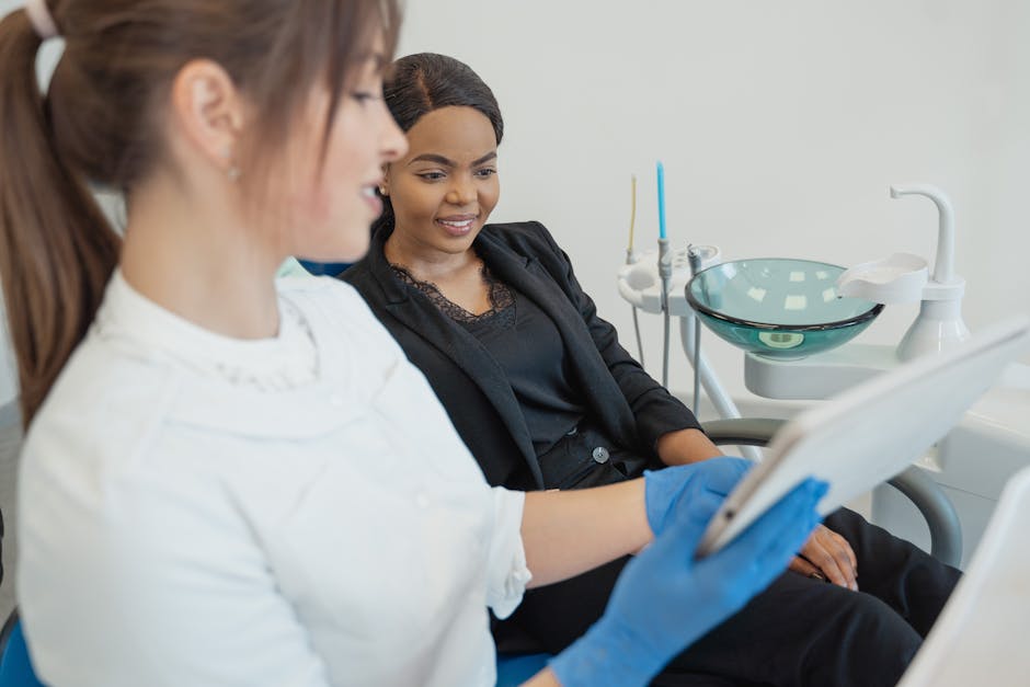
Here is a pattern we see almost every month. A dental practice invests in marketing, the ads bring people to the website, and the numbers just do not add up. Plenty of visits, few calls. The ads get the blame, the budget gets cut, and the real culprit keeps quietly losing patients: the website itself.
A dental website has exactly one job: convert a nervous, busy stranger into a booked appointment. When visitors leave without calling, it is almost always one of six fixable problems. Here they are, in rough order of how much money they cost.
Key takeaways
- Most practice websites lose patients to slowness, hidden contact options, and missing trust signals, not to bad design taste.
- Mobile matters first: the majority of local dental searches happen on a phone, often within walking or driving distance of the office.
- Every claim on the site needs proof next to it, such as reviews, photos of actual staff, and named doctors.
- Fixing conversion usually beats increasing ad spend; the same traffic with a better page costs nothing extra.
Problem 1: The site is slow
A page that takes five seconds to load loses roughly a third of its mobile visitors before they see anything. Practices inherit slow sites from heavy page builders, oversized hero images, and a dozen tracking scripts stacked over the years. On a phone on cellular, in a parking lot, the experience is worse.
The fix list, in order of impact:
- Compress and resize images (most "before" photos are 10 times larger than they need to be)
- Lazy-load below-the-fold media
- Trim tracking scripts to the ones that actually get read
- Use a host and CDN built for speed
You can check where your site stands with Google PageSpeed Insights, and no, your web person saying "it seems fast to me" on their office computer does not count. Test it on a phone.
Problem 2: The phone number is invisible or broken
The most valuable visitor on your site is the person ready to call right now. And sites bury the number in the footer, show it as an image that cannot be tapped, or link it to a number nobody answers.
The fix: a sticky tap-to-call button visible on every mobile screen, a phone number at the top of the homepage in plain text, and tracking so you know which visits became calls. If the office cannot answer after hours, an after-hours booking option or an AI receptionist that books the call-back time keeps that patient from dialing the next office on the list.
Problem 3: No trust signals
Choosing a dentist is a trust decision made in about ninety seconds. Visitors look for proof they can trust you, and many practice sites provide none of it:
- Real patient reviews, ideally pulled live from Google so they stay current
- Photos of the actual office and team, not stock photography of an office that does not exist in any real city
- The doctors' names, credentials, and faces
- Memberships and affiliations, such as ADA or state dental association membership
Stock photos are worse than nothing here. They read as stock to everyone who looks, and they quietly say the practice did not bother. A mediocre photo of your real waiting room outperforms a gorgeous photo of a fake one.
Problem 4: Unclear next step
Many practice websites offer eleven things to do: read the blog, follow Instagram, watch the office tour, download the new-patient form, and somewhere in the middle, book an appointment. Visitors need one unmissable action repeated everywhere: "Request an appointment."
The pattern that works:
- One primary button in the header, repeated after every section that builds desire (services, reviews, insurance)
- A short booking form, name, phone, preferred time, that takes under a minute
- The form's confirmation page telling the patient exactly what happens next ("We will call you within one business hour")
Long multi-page intake forms on first contact kill completion. Save the health history for after the appointment is booked.
Problem 5: The site forgets it is being read on a phone
Most of your prospective patients find you on a phone, often standing in the kitchen holding a toothache. Desktop design shoehorned into a small screen produces pinched text, a hamburger menu nobody opens, and a booking form that fights thumbs.
The fix: real mobile design, meaning the booking flow is tested on phones first, and desktop is checked second. Large tap targets, the phone number reachable without scrolling, and forms that work one-handed. If your web reports show more than 60 percent of traffic on mobile and the mobile experience is an afterthought, you have found your leak.
Problem 6: The content does not answer real questions
The most common questions new patients have are practical: Do you take my insurance? How much is a cleaning without insurance? Are you taking new patients? Do you see kids? Are you open Saturdays? If the site does not answer them, the visitor's next stop is a competitor's site, or the phone call they never make.
Insurance is the big one. A clear page listing accepted plans, plus a plain-language note about out-of-network coverage and payment options, removes the single biggest hesitation in dental search behavior. Answer the awkward money questions plainly and you stand out from every vague competitor.
Frequently Asked Questions
What is a good conversion rate for a dental practice website?
Most practice websites convert in the low single digits of visitors into calls or booked requests, and improved sites reach several times that. The useful benchmark is your own trend: measure calls and form fills per hundred visitors this quarter against last quarter, and let improvement, not a magic industry number, drive decisions.
How can I tell if my website or my ads are the problem?
Compare traffic to contacts. If visits are healthy but calls and form fills are flat across months, the page is the bottleneck; more spend buys more of the same leak. If traffic itself is thin, the acquisition side needs the attention first. A quick analytics review, traffic sources, device breakdown, and contact events, usually settles it within a week of data.
Should the booking form be short or collect insurance details upfront?
Keep the first-contact form short: name, phone, and preferred time. Every extra field cuts completion, and insurance verification happens better after the appointment exists. Request health history and insurance details in a follow-up once the visit is on the calendar.
Conclusion
A website that loses patients is rarely ugly. It is usually slow, cagey about contact info, thin on proof, and hard to book on a phone. Fix those six in order and the same traffic produces more calls, which is the cheapest growth available: no extra ad spend required.
If you want an outside pair of eyes, our dental digital marketing team rebuilds practice websites around conversion, and the FAQ page covers the other questions that come up once the site is fixed.
Sources/References
- Google, PageSpeed Insights: https://pagespeed.web.dev/
- Google, mobile-first indexing documentation: https://developers.google.com/search/blog/2018/03/rolling-out-mobile-first-indexing
Related Reading

Dental Office Cybersecurity Assessment Checklist for Owners
Most dental practices carry serious security gaps they do not know about — outdated firmware, unmanaged endpoints, and unprotected email. Work through this owner-friendly checklist to see exactly where your practice stands.
READ MORE →
How to Plan Computers, Networks, and Software for a New Dental Office
A new dental office lives or dies by the technology plan laid before the walls go up. This guide covers workstations, network, server room, imaging, and software decisions — with a realistic timeline from lease signing to opening day.
READ MORE →
How Managed IT Support Improves Dental Office Operations
Practices on managed support plans resolve issues faster, suffer less downtime, and spend far less on emergency repairs. Here is what actually changes operationally when your IT is monitored and maintained instead of fixed when it breaks.
READ MORE →